As a streaming professional, you likely design your profile on your streaming device, which is usually a broad desktop monitor. You might be thrilled by how sleek and well-arranged everything looks. However, the shocking truth is that about 70% of your audience is accessing your content on mobile devices, not desktops. The result? That meticulously curated profile you’ve designed may translate into a cluttered, difficult-to-navigate mess on a smaller, narrower screen.
If your profile doesn’t offer a seamless experience for mobile viewers, you could be risking viewer engagement and potential earnings. Therefore, it’s crucial to consider a mobile-optimized design that ensures your profile looks appealing, readable, and professional across all devices, ensuring a consistent brand identity.
The majority of streamers design their profiles and check their updates on the same device they stream from. This usually means a desktop or laptop with a wide screen. However, the catch here is that most of your viewers are not accessing your content on a large desktop screen. Instead, they’re scrolling through your profile on their smartphones, experiencing a drastically different version of your profile.
Mobile viewing dominates the live streaming industry. Platforms such as Chaturbate show that about 70% of their traffic comes from mobile devices. So, if 100 people are viewing your profile, 70 of them are likely doing so on a tablet or smartphone.
A significant discrepancy exists between how streamers create content and how viewers consume it. While it’s understandable that most streamers prefer streaming from a laptop or desktop due to the bigger screen and better hardware, this preference can lead to a blind spot. When you view your profile on a wide screen, you’re likely seeing a different version than the majority of your audience.
The design you think is perfectly balanced and clean on a laptop may appear disorganized and overwhelming on mobile. Even if you don’t typically browse streaming sites on your phone, it’s essential to consider your audience’s habits when making design decisions. A mobile layout should deliver clarity immediately, as desktop profiles that translate poorly to mobile can negatively impact follower count, tips, and long-term fans.
Before revamping anything, take a step back to see what your viewers are seeing. Try viewing your profile on various devices, including different types of smartphones. It’s also wise to switch between portrait and landscape modes. This exercise can help you realize how the design elements you thought were engaging could actually be illegible on smaller screens.
Creating a profile that works equally well on desktop and mobile can be challenging as streaming platforms weren’t originally designed with advanced responsive design in mind. They provide a limited set of customization tools, making it difficult to balance aesthetics and usability across different devices.
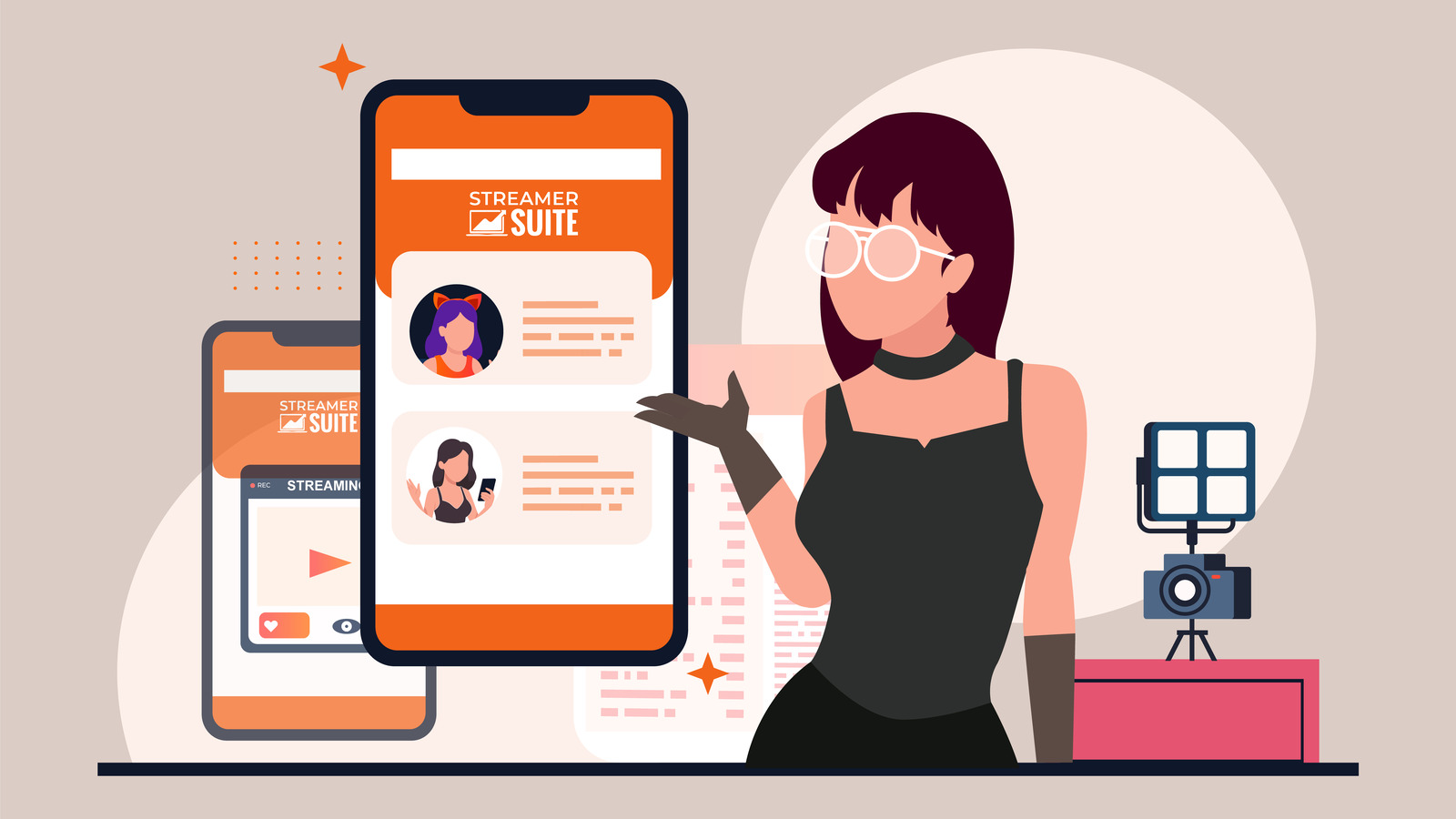
Tackling these challenges requires a mobile-first approach. This is precisely what StreamerSuite offers with its profile design service. Every theme designed by StreamerSuite is fully responsive, automatically adjusting to the viewer’s screen size. Whether your profile is viewed on a desktop, laptop, tablet, or mobile phone, the layout is optimized for clarity and impact.
StreamerSuite incorporates a mobile-first mindset into its designs. When you use these themes, you ensure that your profile not only looks good on your device but also resonates with 70% of users who are accessing your content from mobile devices. This approach can directly boost your engagement, tips, and fan growth.
Check out their mobile-optimized profile designs to get a better understanding of how they handle this challenge.
A mobile-optimized profile not only looks tidy but also positively influences how viewers interact with your content. Small improvements in mobile usability can result in notable increases in engagement and revenue.
To ensure your profile remains mobile-friendly, it’s essential to avoid common mistakes and implement regular check-ups to ensure your design remains consistent across all devices. Think of your profile as a dynamic part of your brand that requires consistent attention.
If you’ve been primarily designing your profile from a desktop perspective, it’s time for a shift in approach. Cater to the majority of your audience who access your content from mobile devices. A mobile-first design is essential to connect with viewers and prevent losing potential fans due to hard-to-navigate profiles.
With StreamerSuite’s mobile-optimized themes, you can ensure that your profile appears professional and functions flawlessly on both mobile and desktop. Concentrate on creating compelling content while knowing your brand leaves a positive impression every time someone visits.
Remember, while your laptop is your creation station, your growth lies in your mobile viewers. Prioritize them to ensure the success of your streaming career.